CompanyCam · 2020
CompanyCam Rebrand
Disciplines
Identity, Logo, Brand System, Environmental
Role
In-house brand designer, logo, color system, environmental design
A 2020 in-house rebrand for CompanyCam: refreshed mark, modernized palette, and a system that scales from app icon to office signage.
 CompanyCam · 2020
Results
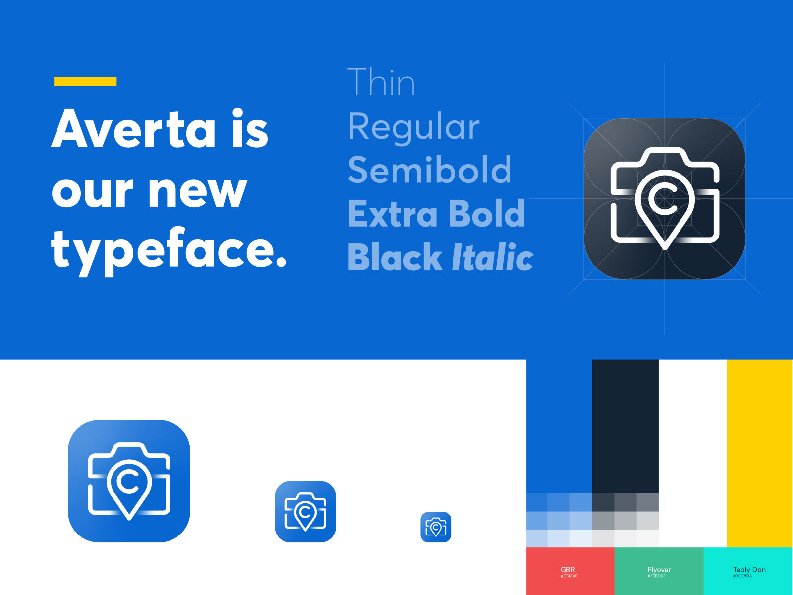
One mark that holds up from app icon to office signage
Consistent identity across product, marketing, and environment
01 / Overview
A small in-house creative team spent much of 2020 on Zoom calls AND rethinking CompanyCam's new look. I was part of a tight group of designers on the rebrand, contributing across the refreshed logo, modernized color palette, and environmental design to make sure the identity stayed consistent across every touchpoint.
02 / Problem
The biggest goal was scalability. The existing mark was too complex to read clearly at small sizes, which is a real problem when your product lives as an app icon on contractors' phones. The palette also felt dated, and the identity didn't reflect who the company had become.
03 / Context
A growing SaaS company with a mobile-first product, a national customer base of contractors, and a brand-new office that needed to feel like the company on the walls. The rebrand had to ship across digital product, marketing, and physical space.
04 / Process
How it took shape.
- 01
Audited the existing mark across every real-world context, app icon, web header, deck templates, swag, signage.
- 02
Refined the shapes and proportions of the logo so it stayed legible and confident at every size.
- 03
Built a contemporary color palette that felt vibrant and professional, and tested it for digital readability.
- 04
Carried the system into environmental design, translating the brand onto walls, signage, and office spaces.
05 / Key Decisions
Why it looks the way it looks.
Scalability first, especially at app-icon size.
I refined shapes and proportions so the logo holds its impact from a mobile app icon up to large-format office signage. If it wasn't readable at small sizes, it didn't ship.
A modernized, more readable palette.
The refreshed palette feels vibrant yet professional, current without chasing a trend, and improves contrast and readability in-product.
Distinctly ownable.
I baked in details that are uniquely CompanyCam, so the mark stands out in the category and reflects the brand's personality more authentically.
06 / Final solution
A refreshed identity system anchored by a new logo, a modernized color palette, and a consistent visual language that carries from the product UI through marketing collateral and into the physical office.
Next project
Dax + Honey Branding