dax + honey · 2020
Dax + Honey Branding
Disciplines
Identity, Logo, Hang Tags
Role
Brand designer, logo, mark system, hang tags
Logo and branding for dax + honey, a collection of wooden toys created for modern parents and their babes.
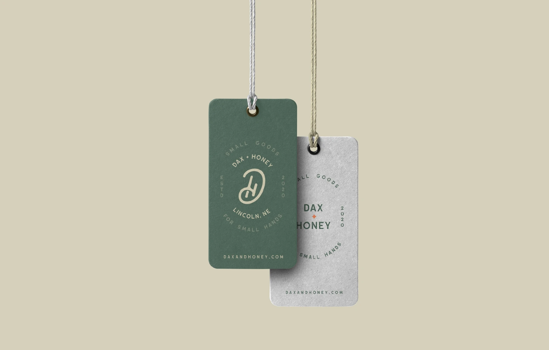 dax + honey · 2020
Results
Full badge, reduced badge, and social mark from one drawn monogram
Minimal, soft, handmade, toy, modern, the brief the system answers to
01 / Overview
Really excited to share this one. I teamed up with dax + honey to create their logo and branding. dax + honey is a collection of wooden toys created for modern parents and their babes, small goods, handmade in Lincoln, NE for small hands.
02 / Problem
Kids' brands default to bright primaries and cartoon mascots. dax + honey is heirloom wood, made by hand. The identity had to speak to the parent doing the buying while still feeling like it belongs in a toy box.
03 / Context
A small, handmade product line sold direct to modern parents, where the hang tag on a wooden truck is often the first and only brand touchpoint.

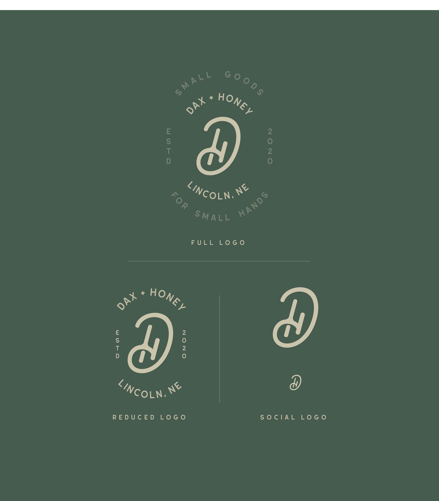
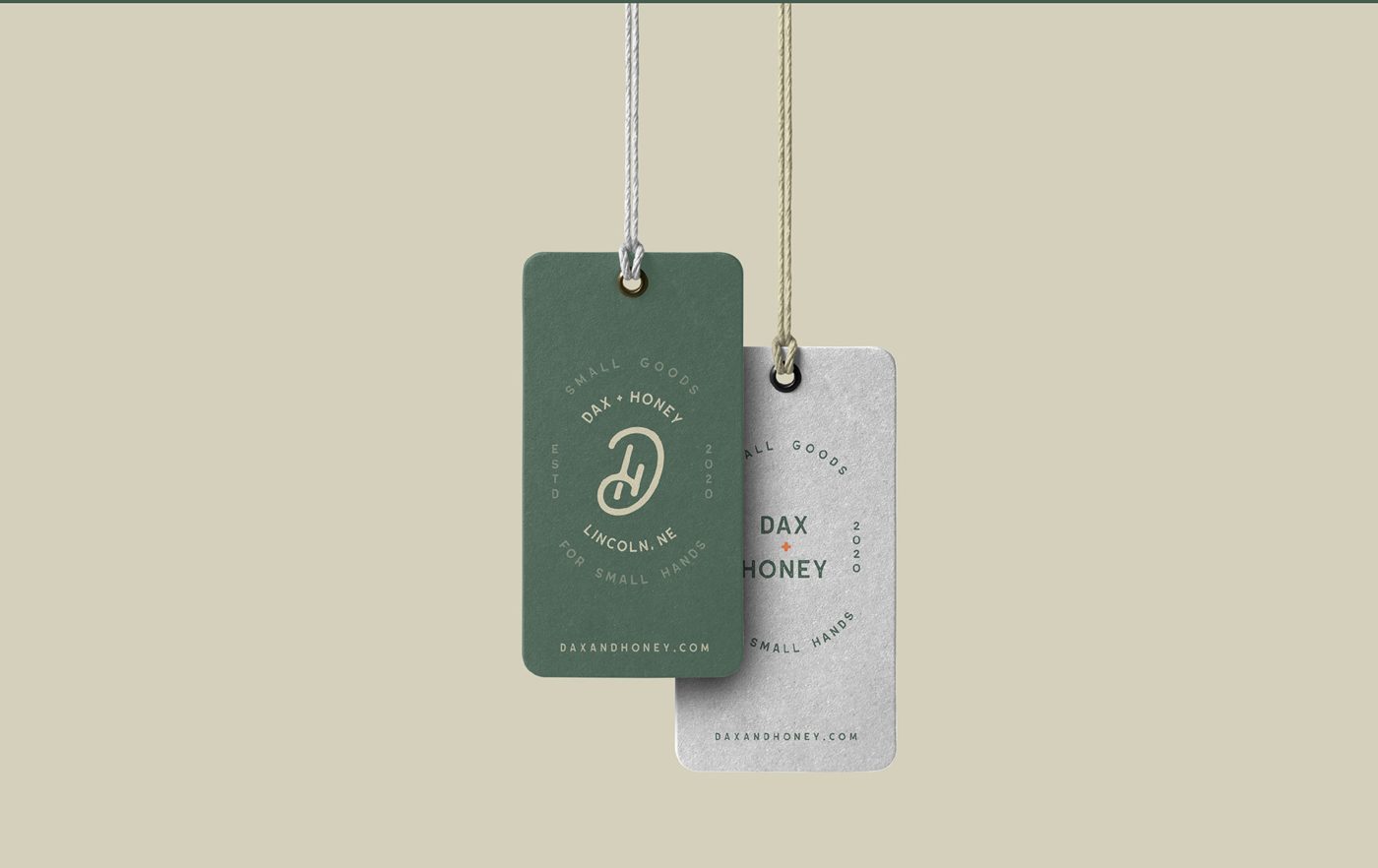
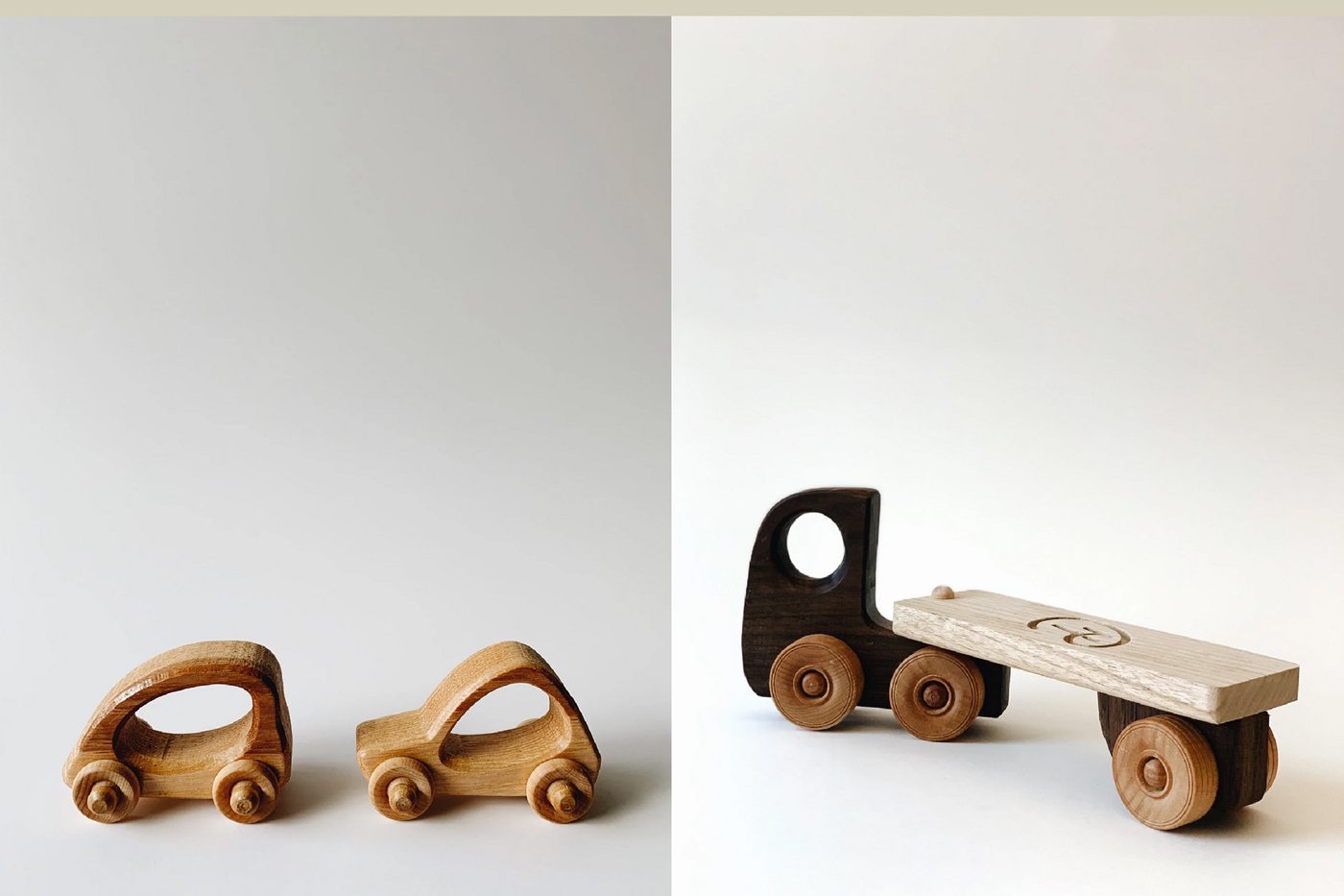
Photo credit: Chase Small, daxandhoney.com
04 / Process
How it took shape.
- 01
Anchored the work in five words the whole system had to answer to: minimal, soft, handmade, toy, modern.
- 02
Sketched the d + h monogram by hand on grid paper, chasing a single continuous stroke that reads as both letters and a loop of play.
- 03
Refined the sketch into a clean, even-weight mark, then built out the full badge, reduced badge, and social lockups.
- 04
Applied the system to hang tags in green board and stamped metal, so the brand carries onto the product itself.
05 / Key Decisions
Why it looks the way it looks.
One continuous stroke.
The d and h are drawn as a single soft loop, handmade in origin, but even-weight and geometric enough to hold at a stamped-tag size.
Soft, not sweet.
A muted forest green and warm sand keep it modern for parents, while the rounded terminals keep it friendly for kids.
A mark for every size.
Full badge for the primary lockup, reduced badge for tags, and a bare monogram for social, so nothing ever gets squeezed into the wrong lockup.
06 / Final solution
A hand-drawn d + h monogram built into a three-tier badge system, full, reduced, and social, paired with a soft forest-and-sand palette that carries from printed tags to stamped metal.
Next project
North—Brand Exploration