North (AI for Freelancers) · 2026
North—Brand Exploration
Disciplines
Identity, Logo Exploration, Brand Strategy
Role
Brand designer, strategy, logo exploration, art direction
Identity exploration for an AI trail guide that helps freelancers navigate contracts, pricing, and the business side of going solo.
The chosen mark
The one that made it.
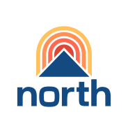
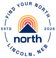
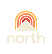
Results
Logo directions explored across mark families
Founders chose a direction to develop into a full system
01 / Overview
North is positioned as a trail guide for independents, contractor-like expertise from day one. The brand had to feel like a companion in your pocket, not a corporate dashboard on a billboard.
02 / Problem
The AI-for-work category is crowded with cold, blue, dashboard-y identities. North needed warmth and direction without losing the credibility of a serious business tool.
03 / Context
Early-stage brand work, a logo exploration phase to pressure-test direction, mark families, and voice before locking the system.
Brand & identity—Logo explorations
Twelve directions.
A round of concepts from clean, minimal wordmarks to quirkier, punk-adjacent symbols, built to sit alongside freelancers, not above them.
- Option 01

- Option 02

- Option 03

- Option 04

- Option 05

- Option 06

- Option 07

- Option 08

- Option 09

- Option 10

- Option 11

- Option 12

Color system
Color palette.
Six tokens: a warm cream base grounded by navy, with sunrise accents that carry the directional, trail-guide energy of the mark, plus a midnight counterpart for dark mode.
light mode · 06 tokens · click a swatch to copy hex
04 / Process
How it took shape.
- 01
Anchored the strategy around three ideas: directional cues, companion energy, and independent character.
- 02
Explored arrows, compasses, starbursts, and path-like forms as marks that point the way without dictating the path.
- 03
Sketched rounded monograms and badge shapes so the brand felt like something that sits with you, not above you.
- 04
Presented a wide field of marks across artboards to find the territory worth committing to.
05 / Key Decisions
Why it looks the way it looks.
Trail guide, not gatekeeper.
The marks lean into directional metaphors, a quiet nudge forward, never a finger wagging.
Warm over corporate.
Aurora gradients, an italic serif accent, and rounded forms keep the brand conversational, a mentor, not a vendor.
Pocket-sized, not billboard.
Every mark was tested at the size it will actually live, a chat avatar, a favicon, a notification.
06 / Final solution
A logo exploration system organized by mark family, directional, monogram, badge, paired with a brand voice and visual language that argues North is the partner freelancers actually want.
Next project
CareSwap Brand Identity