CareSwap · 2026
CareSwap Brand Identity
Disciplines
Identity, Logo, App Icon, Brand System
Role
Brand designer: identity exploration, logo system, app icon, palette & type
A warm, neighborly identity for CareSwap, a private care exchange where families trade childcare as hours and favors instead of money.
App icon
A mark that holds together.
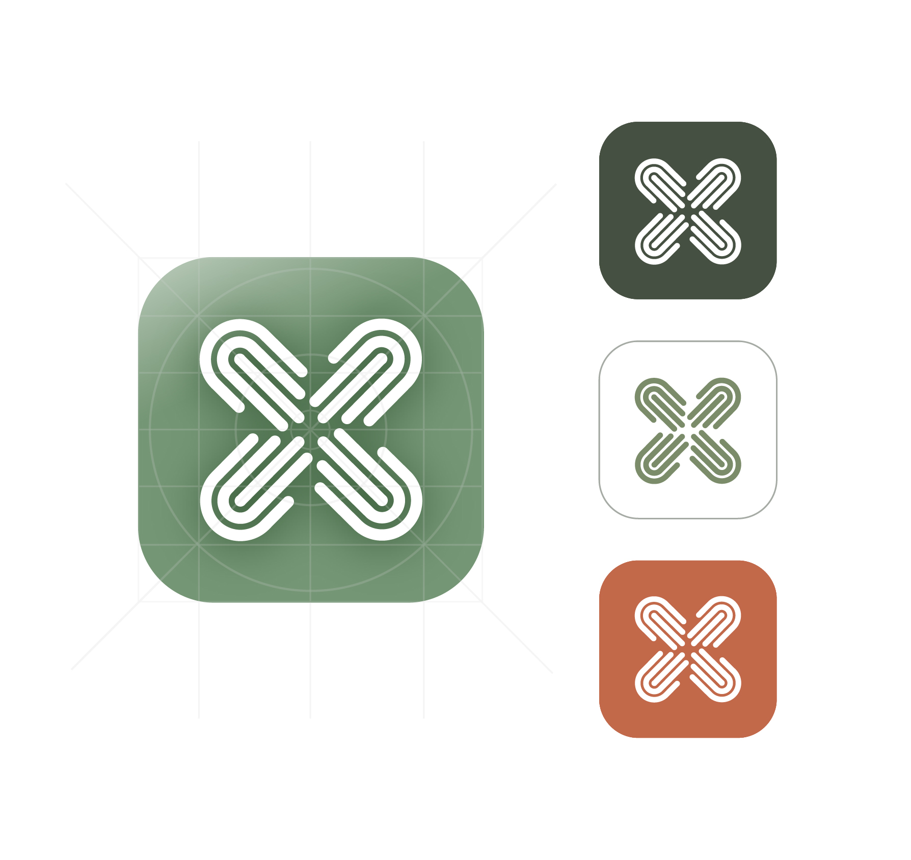
Four interlocking hands reach inward from every direction to form a single quiet mark. On a sage gradient tile it reads clearly at any size, from a home screen glance to a notification badge: calm, familiar, unmistakably CareSwap.

Results
Logo directions explored in round one
Unified mark carried into the app icon
Color tokens with light and dark values
01 / Overview
CareSwap is a private, community-based care exchange: a closed circle where families trade childcare between people they already trust, with no money, no strangers, no guilt. I explored the full brand identity, from a contact sheet of eight logo directions through to a chosen mark, app icon, palette, and type system.
02 / Problem
Care apps default to marketplace energy: gig-app blues, star ratings, stranger profiles. CareSwap is the opposite: a trusted circle. The identity had to signal safety and warmth without slipping into either startup-tech or overly precious, crafty territory.
03 / Context
A mobile-first product built first for childcare, but designed to stretch into eldercare, pet care, and any neighborly help. The brand had to live on a home-screen icon, in onboarding, on a fridge magnet, and on a marketing site, all at once.
Icon system
Built on a grid, tested on a phone.
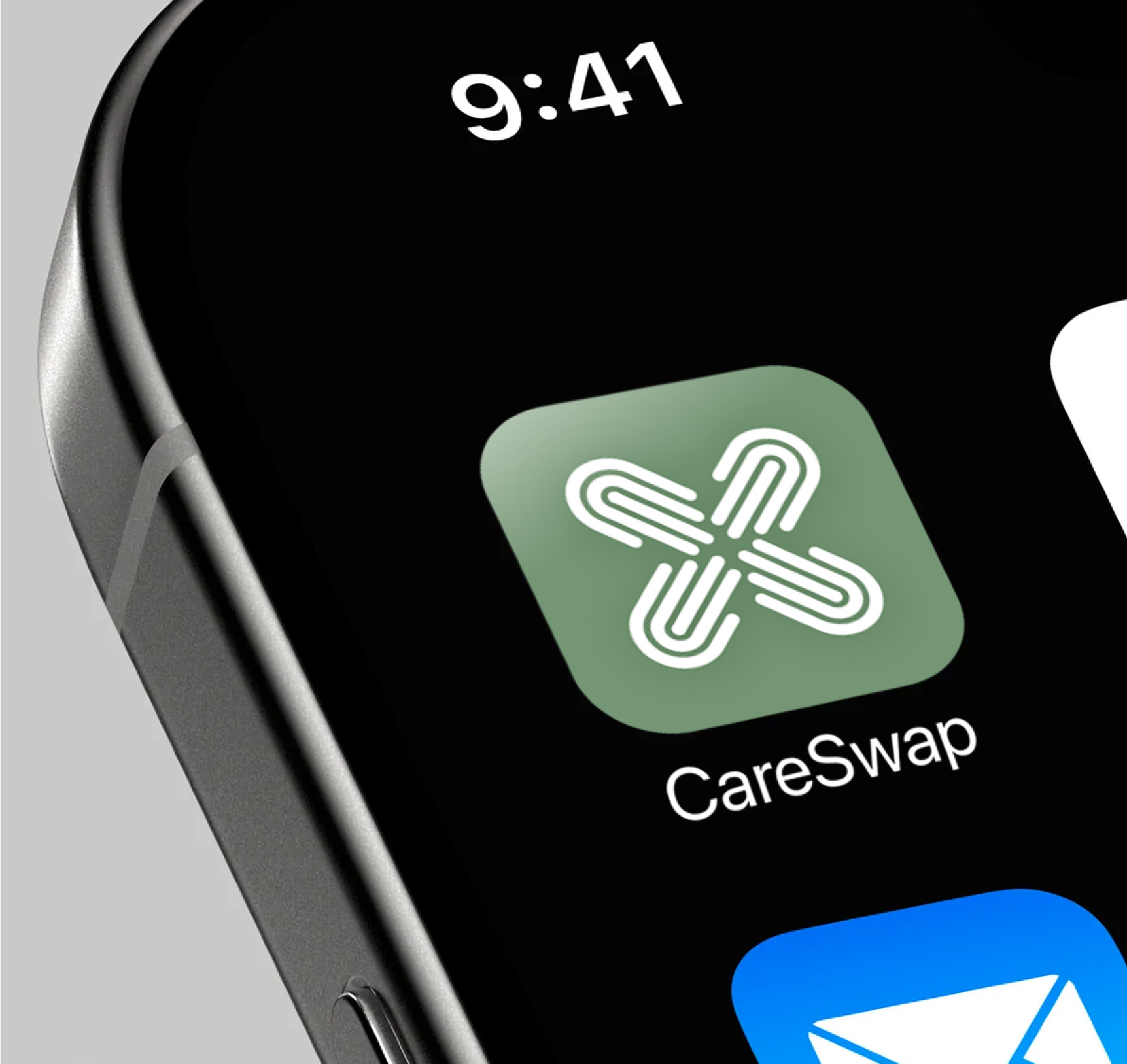
The mark was drawn on a circular construction grid so the four hands keep even weight and optical balance. From there it was cut into four surface variants (forest, cream, sage, terracotta) and checked on a real home screen, where it has to survive next to Mail and a wall of competing color.
Palette & type
Warm, earthy, calm.
Sage grounds the system while peach, salmon, and terracotta lower the temperature of a stressful task. Every token ships with a dark counterpart so contrast holds either way.
Display: Playfair Display
Care closer. Live better.
Body: Manrope
A clear, friendly sans for everyday text. Easy to read across languages and screen sizes. Chosen to lower stress, not raise it.
04 / Process
How it took shape.
- 01
Wrote the brand pillars first: neighbor not stranger, relief not transaction, warm and human, built to grow with families.
- 02
Sketched eight marks across four metaphors (growth, reciprocity, home, and identity) and laid them out as a single contact sheet for review.
- 03
Pressure-tested finalists at 24px and at signage scale before choosing the interwoven-hands direction.
- 04
Built an earthy palette (sage, peach, salmon, terracotta, sand, cream) with light and dark tokens, then paired Playfair Display with Manrope for calm, readable hierarchy.
- 05
Carried the system into an app icon and early web and onboarding mocks to confirm the tone held in real product surfaces.
05 / Key Decisions
Why it looks the way it looks.
Soft, natural forms over engineered geometry.
Leaves, hearts, rooftops, and gentle arcs read as shelter and growth. Shapes that feel grown, not built: the visual language of a calm porch, not a tech startup.
Companion energy, not authority.
Rounded marks with friendly weight sit beside the family rather than above them. The mark had to feel at home on a school folder as much as a phone home screen.
Earthy color instead of startup blue.
Sage, peach, and terracotta lower the temperature of a stressful task. The palette ships with light and dark tokens so contrast holds either way.
Four hands, one mark.
The chosen icon interlocks four distinct abstract hands reaching inward from every direction. Each one is different, yet they fit into something whole, exactly like the families in a CareSwap circle.
06 / Final solution
A calm, earthy identity built around a single interwoven-hands mark: warm enough to belong to, structured enough to organize a busy week. One system covering logo, app icon, color tokens, and type, flexible enough to grow beyond childcare.
Next project
LogoLounge Book 13