CompanyCam · 2025
Maps Feature Enhancement
Disciplines
Product Design, UX Research, Data Visualization, A/B Testing
Role
Lead product designer — research, UX, visual design, A/B testing
Turning an underused map into a core product driver: address search, smart defaults, and a multi-project view that lifted daily active companies 32.6% in a single week.
Results
Increase in daily active company usage within one week
Increase in average monthly unique visitors using the map, mobile and web
Companies adopted the website map feature in the first few weeks
Point NPS increase among users of the maps feature
Decrease in support requests related to map functionality
Enterprise deals closed with the map as a differentiator in sales demos
01 / Overview
I led the design of an enhanced mapping experience for CompanyCam, working with four engineers, a PM, and QA over six weeks. Strategic UX improvements and a visual redesign transformed a feature almost nobody used into one of the strongest engagement drivers in the product.
02 / Problem
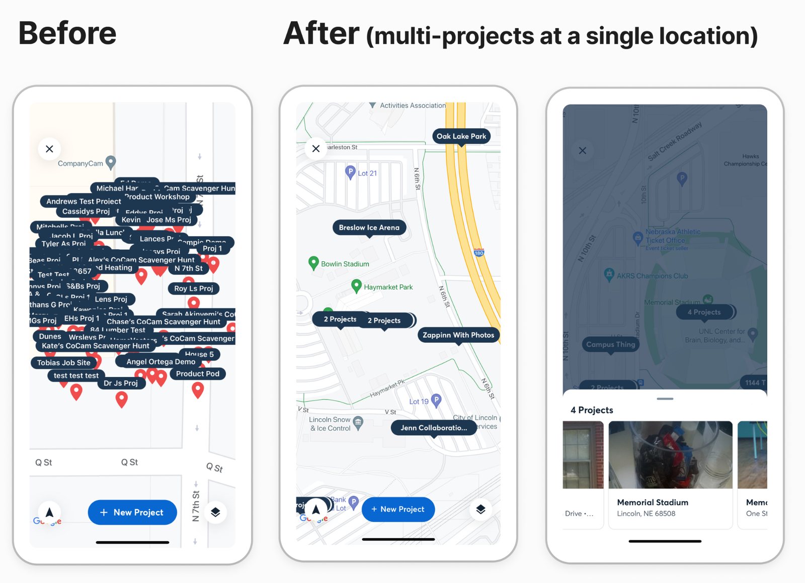
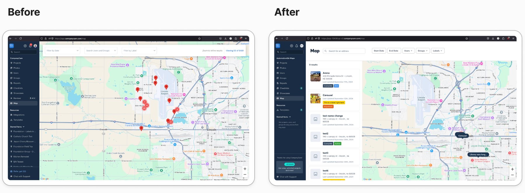
Mapping already existed in the platform, but only a small share of companies touched it. The interface was cluttered for anyone managing multiple locations, there was no way to search by address, the map opened on an arbitrary location in Lincoln, Nebraska, and when several projects shared an address only the newest one appeared. Mobile was barely usable, which cut out the field teams who needed it most. Low adoption meant customers never saw the platform's full value, which showed up directly in retention and expansion numbers.
03 / Context
A B2B SaaS platform used by contractors in the field and back-office staff at headquarters. The work sat under a company-wide Performance and Usability OKR to get paid daily active companies above 50%, so the redesign had to move a real business metric, not just look better.
04 / Process
How it took shape.
- 01
Interviewed 12 customers across company sizes to understand how mapping actually fit their workflows and where it broke down.
- 02
Reviewed analytics — usage patterns, click-through, and full user journeys — to find the drop-off points and the features nobody could find.
- 03
Ran a competitive analysis of mapping in comparable B2B platforms to separate table stakes from real differentiators.
- 04
Completed a heuristic evaluation against usability principles to catalog specific, fixable UX failures.
- 05
Restructured the information architecture, then designed mobile-first and shipped in phases: beta with 10 early adopters, A/B test against the old design, gradual rollout with active monitoring.
05 / Key Decisions
Why it looks the way it looks.
Search by address.
Address-based search was the single most requested capability, and it unlocked SEO and marketing strategies the old map made impossible.
Show every project at a location.
Collapsing an address to its most recent project hid the history customers were paying us to keep. A multi-project view surfaced all of it, with expandable cards so detail never buried the overview.
Default to context, not Lincoln.
Smart location defaults based on user context replaced a hardcoded starting point that was irrelevant to nearly every customer.
Mobile constraints first.
Designing for touch and poor connectivity before desktop produced a cleaner result on every screen size, and finally made the feature usable in the field.
06 / Final solution
A rebuilt map with address search, smart defaults, design system components for visual consistency, and a layered information architecture: color-coded status markers, hover states that surface key metrics without a click, and expandable cards for detail on demand. Shipped in phases so each change could be measured before the next one landed.
Next project
Corporate Portal