Driving feature adoption
CompanyCam · 2025
Maps Feature Enhancement
Disciplines
Feature Design, Data Visualization, User Engagement, A/B Testing
Role
Lead product designer
Timeline
6 weeks
Team
4 engineers, 1 designer, 1 PM, 1 QA
Led the design and implementation of enhanced mapping functionality that dramatically increased user engagement and company adoption. Strategic UX improvements and a visual redesign turned an underutilized feature into a core product driver.
Results
Increase in daily active company usage within one week
Companies adopted the website map feature in the first few weeks
Achievement of the OKR for paid daily active companies
Additional outcomes
Improved customer satisfaction
Net Promoter Score increased by 12 points among users of the maps feature.
Reduced support tickets
40% decrease in support requests related to map functionality.
Feature expansion
Success led to a greenlight for additional mapping features on the product roadmap.
Sales tool
Became a key differentiator in sales demos and contributed to closing 5 enterprise deals.
01 / Overview
I led the design of an enhanced mapping experience for CompanyCam, working with four engineers, a PM, and QA over six weeks. Strategic UX improvements and a visual redesign transformed a feature almost nobody used into one of the strongest engagement drivers in the product.
02 / Problem
Despite having mapping functionality in the platform, only a small percentage of companies were actively using it. The interface was cluttered and hard to navigate for anyone managing multiple locations, there was no way to search by address, the map defaulted to an arbitrary location (the Railyard in Lincoln, Nebraska), and when multiple projects existed at a single address only the most recent one was visible. Mobile responsiveness was poor, which limited field team usage. The business impact was clear: low adoption meant customers weren't realizing the full value of the platform, which affected retention and expansion metrics directly.
03 / Context
A B2B SaaS platform used by contractors in the field and back-office staff at headquarters. The work sat under a company-wide Performance and Usability OKR to get paid daily active companies above 50%, so the redesign had to move a real business metric, not just look better.
Research & discovery
User interviews
Spoke with 12 customers across different company sizes to understand their workflows and pain points with the current map feature.
Analytics review
Analyzed usage patterns, click-through rates, and user journeys to identify drop-off points and underutilized features.
Competitive analysis
Reviewed mapping features in similar B2B platforms to identify best practices and innovation opportunities.
Heuristic evaluation
Conducted a thorough evaluation against usability principles to identify specific UX improvements.
Storytime, from interviews to insights
Five themes emerged from customer interviews. Step through each chapter to see the problem, what users actually said, and the insight that shaped the design.
Chapter 1 of 5
Problem statement
Through offline discovery work with customers, I identified that the Map UX lacked the ability to search for a specific address and view all associated projects at a location on web and mobile.
Insight
User win: eliminate frustration when visualizing and managing all projects. Business win: differentiate by delivering a consumer-grade experience aligned with the Performance and Usability OKR.
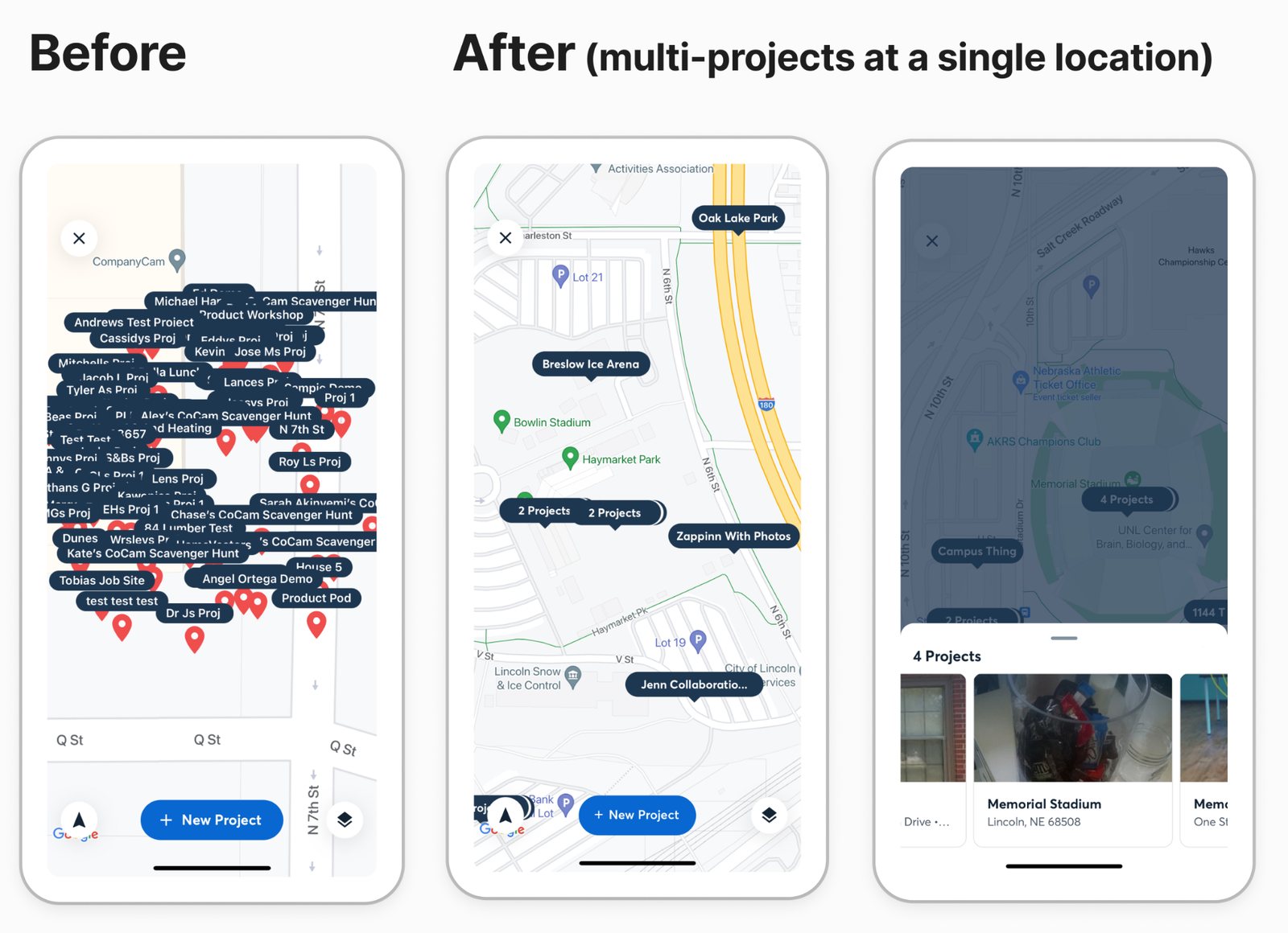
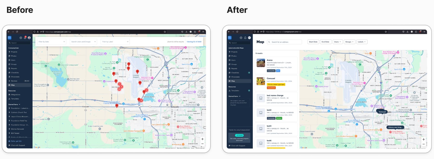
Before & after
Before
- No address search capability limited SEO and marketing efforts
- Always defaulted to an irrelevant location (Lincoln, NE)
- Only 1 project visible per location, hiding critical data
After
- Address-based search unlocked SEO and marketing strategies
- Design system components improved visual consistency
- Smart location defaults based on user context
- Multi-project view reveals all work at each location
43% increase
in average monthly unique visitors using the map feature (mobile and web)
04 / Process
How it took shape.
- 01
Interviewed 12 customers across company sizes to understand how mapping actually fit their workflows and where it broke down.
- 02
Reviewed analytics, usage patterns, click-through rates, and full user journeys to find drop-off points and the features nobody could find.
- 03
Ran a competitive analysis of mapping in comparable B2B platforms to separate table stakes from real differentiators.
- 04
Completed a heuristic evaluation against usability principles to catalog specific, fixable UX failures.
- 05
Framed the problem with the team: the map lacked address search and a way to view all projects at a location on web and mobile. User win, eliminate frustration when visualizing and managing projects. Business win, deliver a consumer-grade experience aligned with the Performance and Usability OKR.
Implementation & testing
Shipped in phases.
- 01
Beta testing
Released to 10 early adopter companies for feedback.
- 02
A/B testing
Compared old vs. new designs to measure engagement.
- 03
Gradual rollout
Phased rollout to all customers with active monitoring.
- 04
Continuous improvement
Collected feedback and iterated post-launch.
Key learnings
Data-driven design
Pairing qualitative research with analytics helped prioritize decisions effectively.
Iterative approach
Phased rollouts caught issues early, reducing risk before full deployment.
Cross-functional collaboration
Close partnership with engineering and PM kept vision and feasibility aligned.
Mobile-first thinking
Designing for mobile constraints first led to cleaner designs across devices.
05 / Key Decisions
Why it looks the way it looks.
Redesigned information architecture.
Restructured the map interface to surface critical information at a glance, with a layered approach so users could drill down without losing context: color-coded markers for status, hover states that show key metrics without a click, and expandable cards for detail.
Enhanced visual design.
Updated the visual language to align with the design system while improving readability and reducing cognitive load: cleaner, more modern map styling, improved contrast and accessibility, and consistent iconography and hierarchy.
Mobile-first responsiveness.
Rebuilt the mobile experience for field teams: touch-optimized controls, adaptive layouts across screen sizes, and graceful behavior in poor-connectivity scenarios.
06 / Final solution
A rebuilt map with address search, smart defaults, design system components for visual consistency, and a layered information architecture: color-coded status markers, hover states that surface key metrics without a click, and expandable cards for detail on demand. Shipped in phases so each change could be measured before the next one landed.
Next project
Corporate Portal